Responsive Design & Mobile Optimization
Responsive Design - Your Website Perfect on Every Device
In today’s digital world, users access websites from a wide variety of devices - from smartphones to tablets to large desktop monitors. Responsive design ensures that your website is optimally displayed on all screen sizes and provides an excellent user experience.
Why Responsive Design is Essential:
- Mobile-First: Over 60% of website visits now come from mobile devices.
- SEO Advantage: Google favors mobile-optimized websites in search results.
- Better Conversion: Users stay longer and convert more often on well-optimized mobile pages.
- Future-Proofing: A responsive design works on future devices and screen sizes as well.
My Approach to Responsive Design:
- Mobile-First Development: I start with the mobile version and then expand for larger screens.
- Flexible Layouts: Using modern CSS techniques like Flexbox and CSS Grid.
- Optimized Performance: Adapted image sizes and loading times for mobile connections.
- Touch-Optimized Controls: Buttons and navigation elements are optimized for touchscreens.
Related Services
- Performance Optimization - Mobile performance is crucial
- Interactive Design - Animations and micro-interactions for all devices
- SEO Optimization - Mobile websites rank better on Google
Related Projects
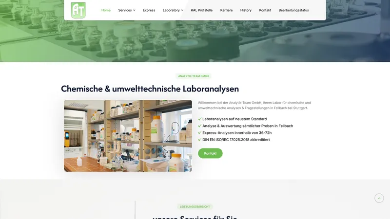
Website Relaunch for Analytik-Team GmbH
Analytik-Team GmbH

Long-term Support and Development of the PS Consulting Website
PS Consulting
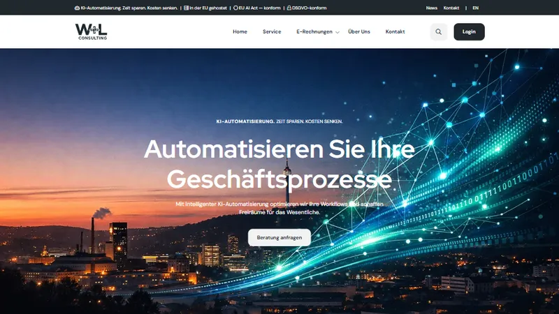
Design, Development and Support of Website for W+L Consulting GbR
W+L Consulting GbR

Author Website for the Time Travel Saga – TYPO3 & Atmospheric Design
Mirko Hübner